

CinePlay
Defining a new genre
of entertainment.
ABOUT
To define CinePlay through brand communication and design as a first mover in producing and digitally distributing Indian theatre content, globally. The challenge was to bring clarity to the brand communication, making it more inclusive between theatre purists and avid cinema-goers.
ROLE
The focus was shifted from the format of the
content and directed to CinePlay’s principle mission; To create global access to rich theatre content from the country while archiving it for posterity. The brand became simpler to design for and communicate to audiences and partners alike.
Identity Design

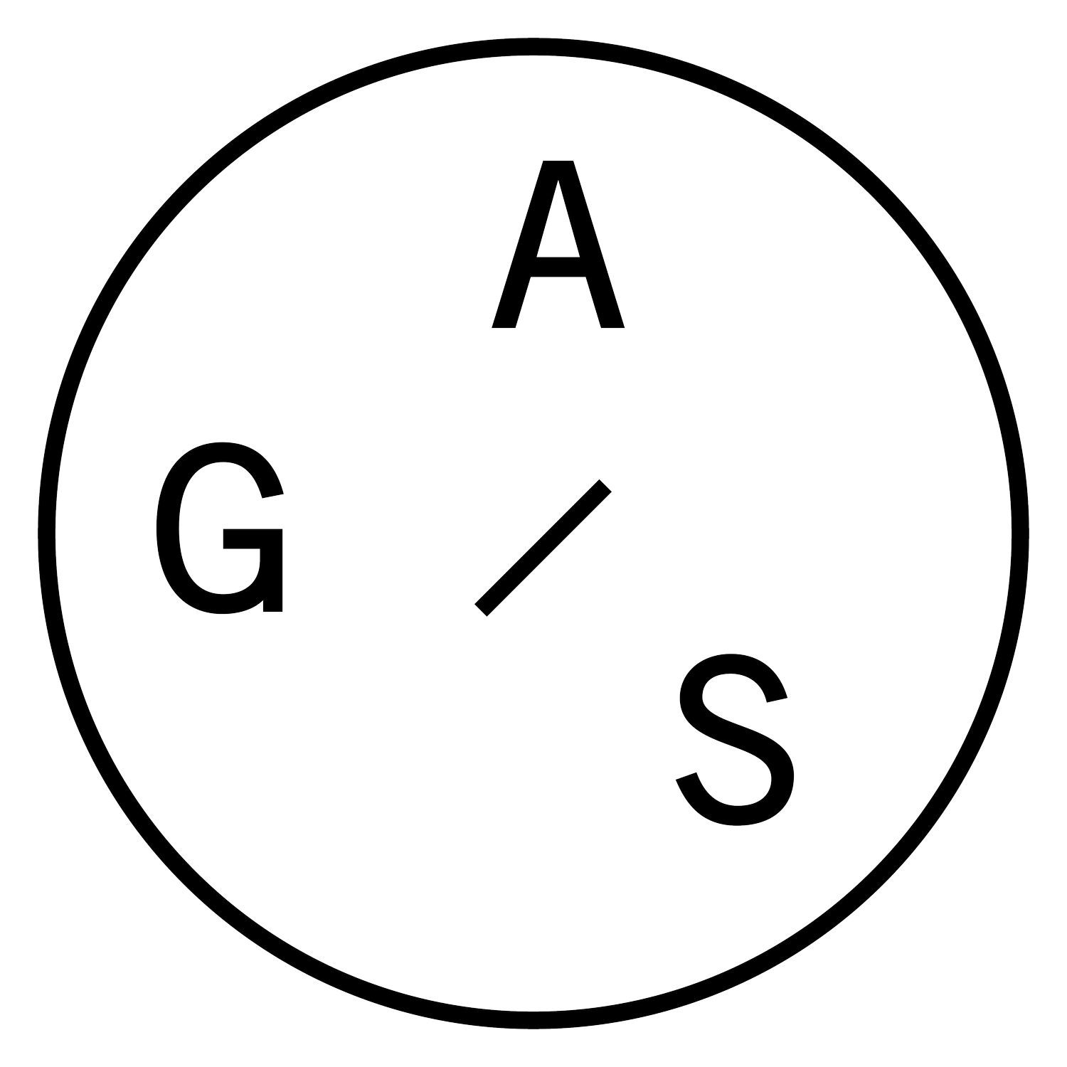
The Shard
CinePlay’s shard is a the letter ‘C’ designed as a birth of a new and exciting format of entertainment. At G.A.S we gave the shard, a purpose, a role to play in the brand’s visual language and made it suitable for digital formats.

Typography
The wordmark and the shard were separated. The word mark was left unaltered as designed earlier - to symbolise the coming together of 2 separate formats of storytelling, cinema and theatre.

Reconnecting with your audience.
Communication strategy
Carved out as ‘a new genre of entertainment’ - CinePlay’s challenge was in marketing its concept to an audience that was already niche and divided into film and theatre goers. nobody understood its fully - was it a film? Was it a play?
The brand’s purpose was something we defined with a simple insight. Less focus on the product’s format and more on the intent of the company which was to archive theatre for posterity.
The line : Cineplay : Stories from the stage made this core thought and intention more relatable to everyone. Indian stories from the stage made the concept accessible to people, globally.
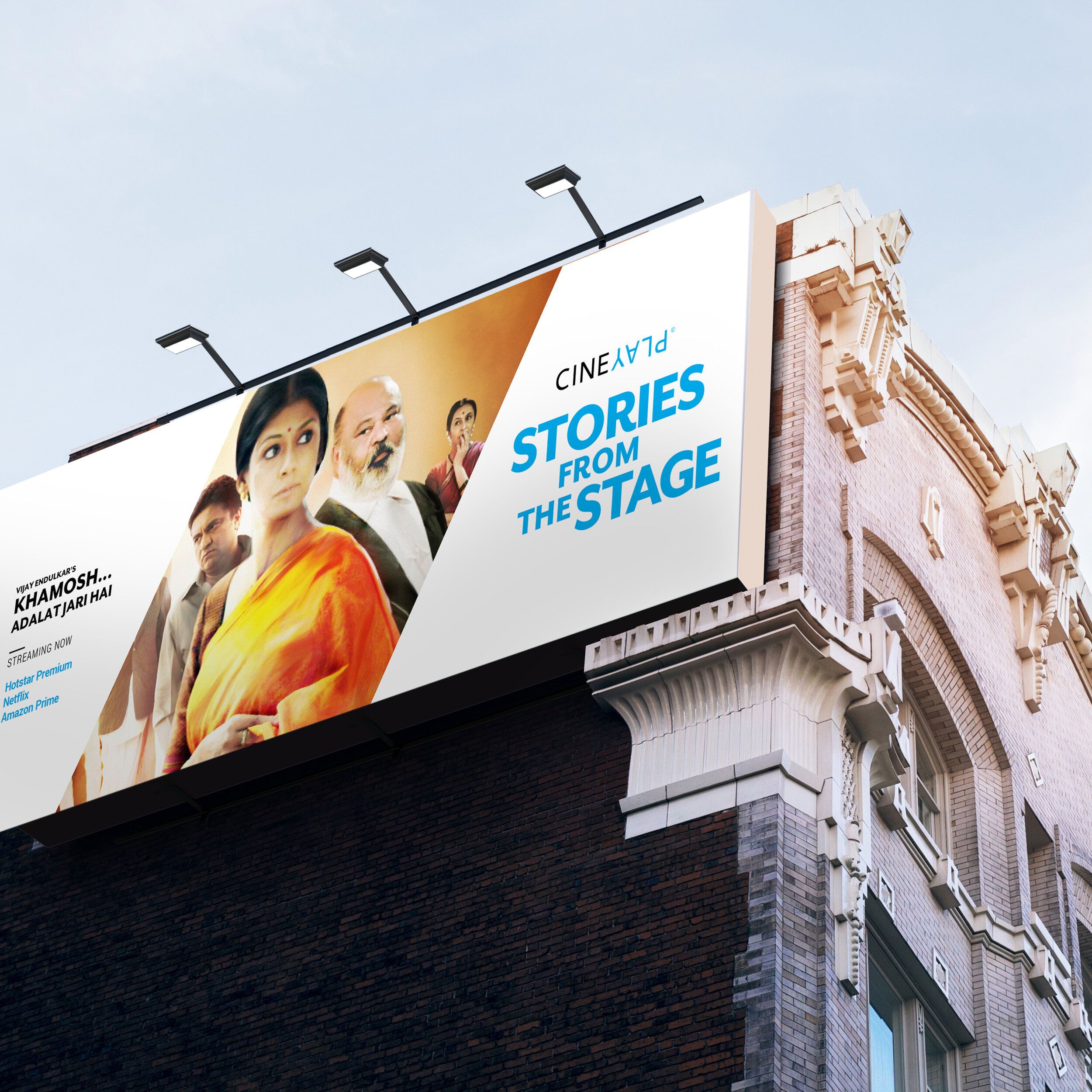


What does a Cineplay poster look like?
During on ground trials and screenings, a CinPlay poster needed to compete alongside commercial films. A decision was made along with the marketing team that the posters needed to be designed to sit alongside the bigger movies, however the poster would still have a CinePlay identity.
We innovated on the layouts for the posters, where we set the billing
apart from traditional poster design. The signature blue black and white made its presence felt even when a CinePlay poster stood by itself at a movie theatre.


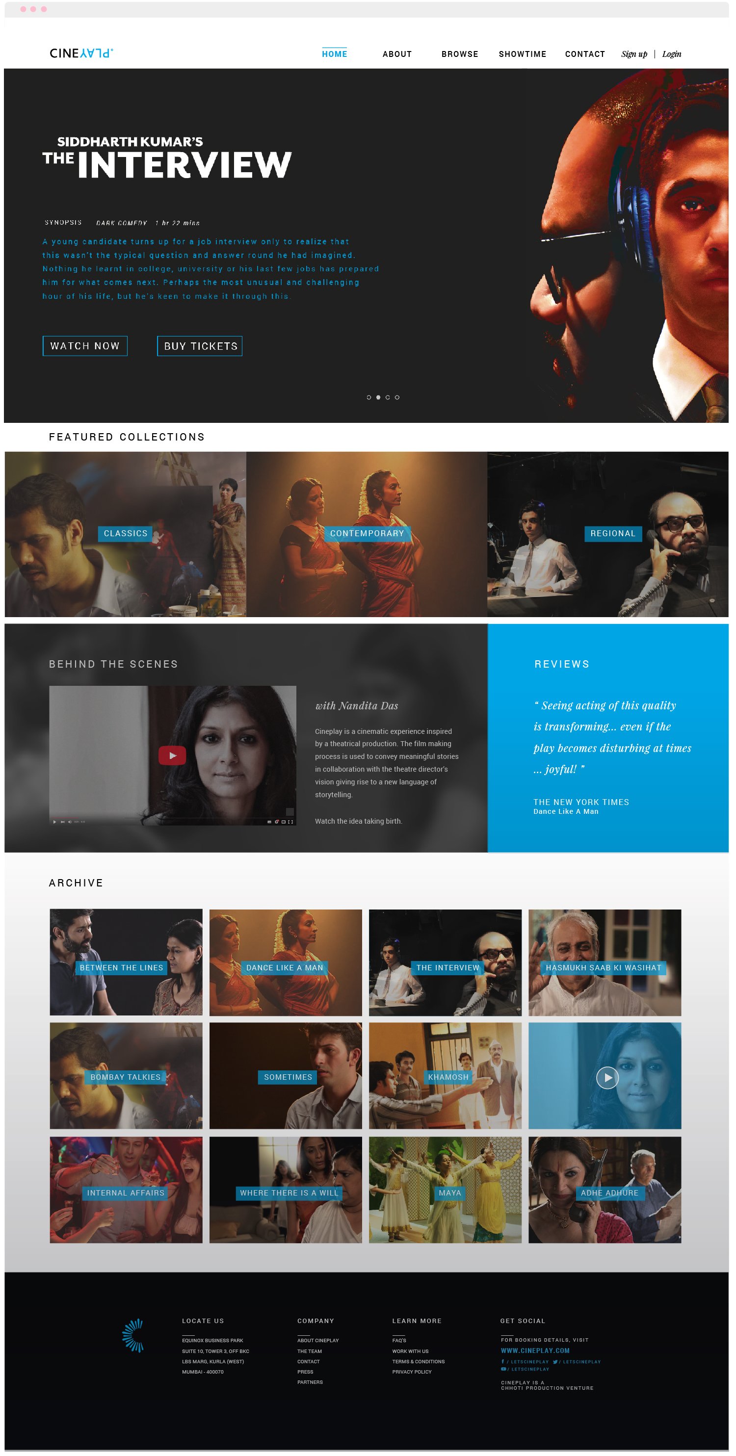
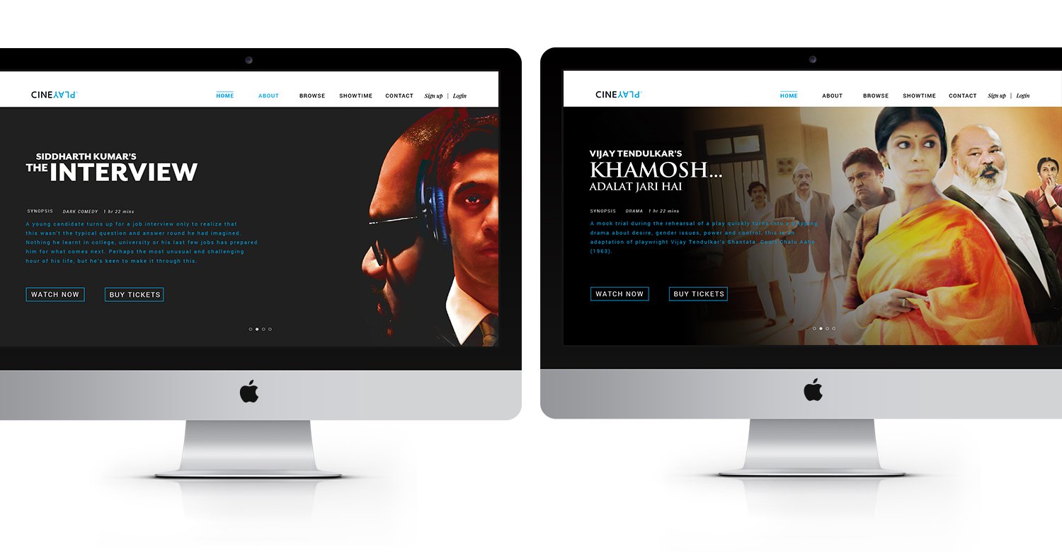
Website design
The website was designed for viewers to be able to rent a CinePlay from their homes. The website featured an archive of all CinePlays, about the company and concept and also had BTS and trivia for enthusiasts.

CREDITS
Creative Direction : Devashish Guruji
Design Lead : Devashish Guruji
SOLUTIONS
Brand Strategy
Brand Communication
Re-branding
Design
PROJECT
Chhoti Productions
2016
Entertainment, Media